I said something in my little rant the other day that’s stuck with me: The book is the art.
To me, Harry Potter’s fabulous because it’s a whole experience. The cover art and the story work together. It’s got color, movement, focus, texture. You’re sitting there in your reading chair on a cold day (possibly snowing), drinking hot chocolate, bundled up with this heavy hardback book in your hands.
Your head’s in the story. Your eyes are seeing the specialized fonts in the header and the brilliant colors of the edge of the binding. Every once in a while, your eyes get a treat in the form of a graphic buried in the text denoting handwritten notes that give you a sense of intimacy with the events that you don’t get with typesetting. Your arms feel the weight of good storytelling. Your fingertips brush the dust jacket and feel the texture of the thick mottled matte paper, they pinch heavy paper between them and turn the pages.
I have a leatherbound edition of Alice in Wonderland. It, too, is an experience, with a little bit of the feel of age. Deckle edges are the best.
I can tell you all the usual reasons I decided to publish independently, and give you another half dozen reasons why Dude enthusiastically encouraged me to do so (the biggest being that he has faith in my work). But after my little temper tantrum, it occurred to me that there was one other reason I really hadn’t thought about much:
The whole book is the art. I had a vision for my book, the series. Even when I was sending out queries galore, I had a vision and I’ll tell you, I was vaguely depressed to think that even if I got The Call, someone else was going to take my vision and put his own spin on it–and he may or may not give a fat rat’s ass what I want or what I see. That’s not to say a graphic artist wouldn’t have done better than I could have and surpassed my vision by light years. It’s simply that I would have no control over it, a little input that might or might not be taken into account, and perhaps no veto power, especially if he was up against a deadline. This is not a client-vendor relationship between the author and the artist.
Interior design is a relative static: You design so as to make the reader unaware of your design. You don’t give him a headache, you don’t wear his eyeballs out. In short, as Zoe put it, you don’t piss him off.
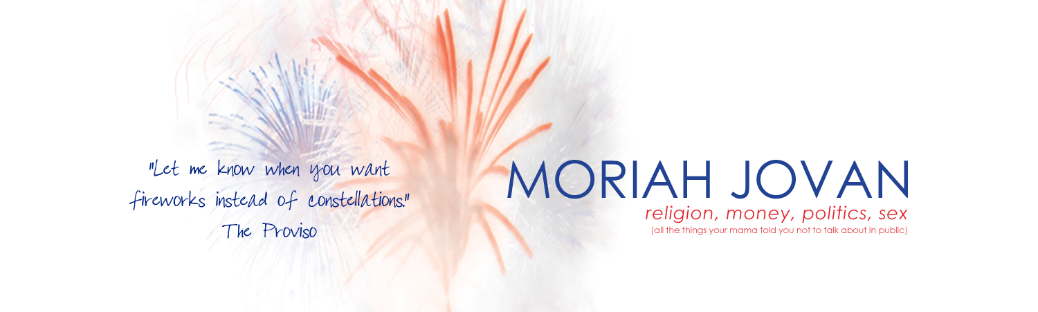
I can give no advice with regard to other indies and how they handle cover design. All I’m saying is that I’m a very visual person and for me, the story is not the art.
It’s the book.
OMG, look how beautiful you are!!!!
Mojo,
I loved this post. I absolutely agree that the whole book has to work together. Few things make me want to scream at a book more than when the text says the protagonist is blond with green eyes, and on the cover he/she has black hair and blue eyes. Okay, so it’s not always hair and eye color, but those kind of discrepancies really bug me because they make it clear that whoever did the cover art either didn’t read or didn’t care about what was in the book. Ugh.
Anyway, good post.
By the way, in order to prove that I’m not above shameless solicitation, I recently wrote a post on my blog that I would value your input on. You’ll see it if you click on my name. If you get time, please stop by. Anyone else who reads this is welcome, too, which proves that I’m not above shameless plugs on a broader scale, either. 🙂
Thanks.
Eva, stop. You’ll make me blush. (Trust me, that’s not hard to do.)
Adam, plug away. I went and read your post and, as I said in my comments, I’ll have to stew on that a while, because it’s a subject near and dear to my heart.
Thanks, Mojo. And, again, I really enjoyed your thoughts here on the whole of a work.
Co-signing! I agree that the book is the art (and I love your design for your book)!
I’m with you. I don’t like the idea of not knowing what’s happening or where my book is going through the levels and especially that I won’t have any input on my cover. (Although I hear they ask but it’s basically a case of one ear out the other). That’s why I like working with companies that are in a partnership with their authors and really work to bring out the best book possible. Makes the story and the whole package all the more fun to immerse oneself in. 🙂
Very good thoughts! And I think in terms of, while Harry Potter is just an amazingly beautiful product, and the big publishers CAN create a product with all those wonderful elements, WILL they do it for me?
Nope, probably not.
So that means that while I can’t at this stage of the game, afford all those wonderful aspects of the dustjacket elements of the HP books, and the hardcover binding, etc, I can control what I can control.
And the thing that galled me the most, was that my novel that I’m putting out next fall, would have the title changed.
That’s so common now. Especially in genre fiction. And I don’t want some lame, cutesy title, that has nothing to do with my book.
I agree with you. And I think this might be why indies are a totally different breed of writer. Whatever my skill level is or isn’t. And whatever my ability to pay vendors is or isn’t, it’s MINE from start to finish, every aspect.
And that’s very important to me, and clearly it’s very important to other indies.
Eva, yes she is!
Rae, I have noticed that there’s a lot of cooperation between the romance/romantic erotica epresses in their authors and graphic designers, and that’s only to the good.
Yet again it seems that the epublishers in this genre are leading the way, being innovative. It’s NY who’s picking up their authors, their heat levels, and having to re-think their e-royalty rates because of Ellora’s Cave, Loose Id, and Samhain.
.
I hadn’t thought of this until an article in Print magazine about Dave Eggers and his McSweeney’s press. Since then I’ve thought about it constantly (and it’s been a reason I’ve had secret relief accompany my irritation when a notoriously badly designed press decides to reject my work after all). I’m glad we are kin on this.
I’m all about the experience. If I could have done a matte/gloss combo on my cover (heavy on the matte) and a slightly embossed spine title, I would’ve.
.
Holy crap, this thing’s heavy.
It’s all the words.
.
There are a lot of them. I read, oh, the first forty pages last night so I should be done by, oh, April (2012). So far so good. I was nervous I would hate it, but so far, no problem.
ps: I’m finally walking down to the post office after school today.
Well, Th., I figure if you don’t stay up nights to read it because you can’t bear to put it down, I must not have done my job. 😉
I went to my mailbox Monday and was disappointed.
.
I know. I’m a terrible person.
Or, more accurately, my wife was involved in so many good things late last week that I couldn’t make a PO run. You should have it by the end of the week.