Shoal Creek Valley, in Clay County.
I’ve never been so happy to be wrong (about Olathe) in my life. Happy dance!
Never underestimate the commercial value of mental illness.

Shoal Creek Valley, in Clay County.
I’ve never been so happy to be wrong (about Olathe) in my life. Happy dance!
And it’s ugly, too.
no images were found
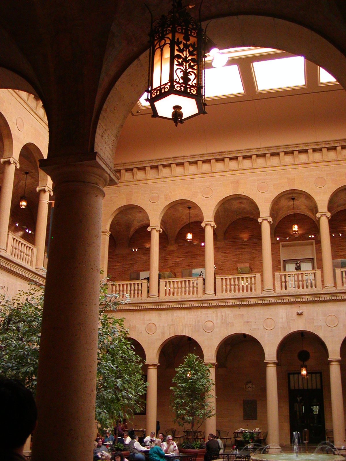
The Nelson-Atkins Gallery of Art is one Kansas City locale that plays a fairly significant role in The Proviso. I mean, the whole city is rather its own character (or at least, I tried to make it so), but this one spot, I think, plays the most parts other than “Chouteau” County and its pretty courthouse and The Country Club Plaza. It hosts a senatorial fundraising party, it’s where one of the female protagonists goes to meditate, and it’s the gallery chosen to premier a new painting by an infamous artist.
Anyhoo, I see on BlogKC that the gallery’s having to cut back like everybody else. Well, you see, the difference this time is because of that, uhm, $200M construction trailer brilliant Steven Holl masterpiece called the Bloch addition that they built next to the neoclassical structure.
Time called it the number one “(New and Upcoming) Architectural Marvels.”
Adding a new wing to a neoclassical museum, Holl devised a spectacular update on classicism: an irregular series of volumes that cascade down the museum’s lawn and glow from within. The effect against the nighttime sky is nothing short of magical.
If you say so, but I’m just an ignernt country rube who obviously doesn’t know brilliance, especially when it cost more than it was sposed to. And why are all the kudos about its brilliance coming from people who don’t live here?
(Poor Rodin. They displaced The Thinker.)
Now, three problems with this thing.
A. It’s ugly. Did I mention that yet?
B. It’s expensive to light (because, you see, its only marginally redeeming architectural feature can only be seen at night when it’s lit).
C. It’s the most inefficiently designed interior space I’ve ever seen.
So what is one of the things they’re having to cut? The hours and the lighting. And I’m telling you, folks, in the daytime, without the lighting, it looks like a construction trailer/storage shed.
 Now, I’m not going to be one of those people who would start crying if they began to charge admission, because, well, it’s a very prestigious gallery in terms of its collection and yeah, I’ll pay to get in. And I know they’re not going to knock the damned thing down especially since they spent so much money on it.
But I just need to poke a stick and say, you spent a whole lot more money than you thought you would on something the citizenry doesn’t really like and now you can’t pay to make it do its featured thing that somewhat redeems it.
Enjoy. Or don’t. If you live here and you feel me, meet me in the Rozzelle court (closed Tuesdays now, remember!) and we’ll commiserate.
.
no images were found
Awhile back, there was a discussion going on over at Six LDS Writers and a Frog about architecture. Why that is going on on a writer’s blog by a permablogger there who makes no connection to literature that I can see (I kid because I love), I do not know.
But I enjoyed his post and the discussion, and it sent me looking for my growing fascination with mid-century modern and, in particular, Mies van der Rohe. Farnsworth House is one of his more famous residential works.