
Quick linguistic review. From the Greek, homo- = same.
 On Twitter the other day, I clicked on a URL that normally wouldn’t interest me, but for some reason caught my eye. It was about the new Kraft corporate logo:
Read the whole article, because it’s instructive, and I’ve been thinking about that off and on ever since. I don’t know why. Then I saw Sunday’s Wal-Mart insert and saw its new(ish) logo:
 Do you see a difference?
Most of you will, I’m sure, since they’re back to back, but I, in all my ADDness, will glance and not see anything of import to differentiate the two. Thus, I will gloss over both. I’ve seen many other, similar logos, but I couldn’t tell you what companies they belonged to. I guess that’s my point.
I follow several different blogs that talk about social networking, branding, marketing, etc. because I know zero, zilch, nada about all this bullshit and I’d really rather not learn. However, it seems to me, in all my naïveté, that you would want your brand/logo to stand out, no?
All the writerly/agently/editorially blogs talk about branding one’s writing. Do we have logos or don’t we? How does one “brand” something that is, inherently, about … you? You have one product, or two, maybe sixteen, but really the product is you. If you have a following, your following buys you. If people don’t like your product, people don’t buy you. You are identifiable by your name.
But then there’s something like this:
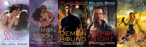
Okay, I’m as much a sucker for matching anything and thematic continuity as the next fashion-obsessed girl, and don’t mistake me—these are gorgeous covers and put ’em together like this, they look plenty different. But put me in a bookstore without a list and I won’t remember which one I have and which one I don’t. What’s scary is that I could chalk that up to my gnat-like attention span or my ADD, except I’m not the only one with the complaint. By far.
It’s not just corporate brands or book covers. It’s cars, too.
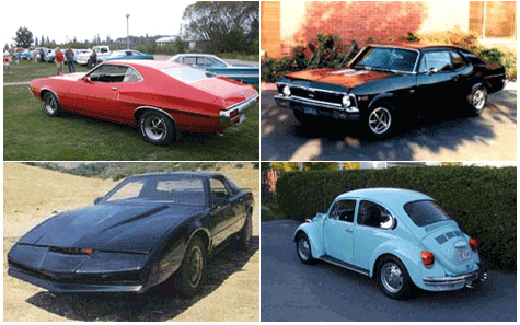 When I was in high school, a girl in my class had a ’72 Torino. A guy had a ’69 Nova. Another had a KITT car. I drove a ’72 or ’73 Beetle (one of those freaks of nature with the auto
-clutchstick). Occasionally. I used to be able to tell what car was what, and possibly the year.
But now?
 They all look alike. It was annoying when I didn’t have a vested interest in cars, but I went looking for a luxury car for Bishop Steel Baron (Magdalene, book 3) and I found … nothing that would differentiate a luxury car from a cheap Saturn, it was downright maddening. Are you kidding me? All this time I’ve been attributing that to the laws of aerodynamics and that’s probably the most likely explanation for it, but across the brand/corporate spectrum, from Saturn to Volvo, from economy to luxury, from SUV to SUV, the vast majority look alike.
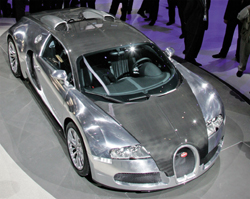
I put him in a Bugatti, in case you’re wondering.
Don’t get me started on tract housing, and that includes McMansions.
I know it’s human nature to be drawn to the familiar, but humans also like variety. I’m feeling a bit of brand oppression. The smoothing out of fonts, the smiley faces and flowers, the streamlining, the … aerodynamics.
Am I missing something? I thought branding was about differentiation. If people can’t tell you from someone else, how do they know to throw their money at you?