
★★★
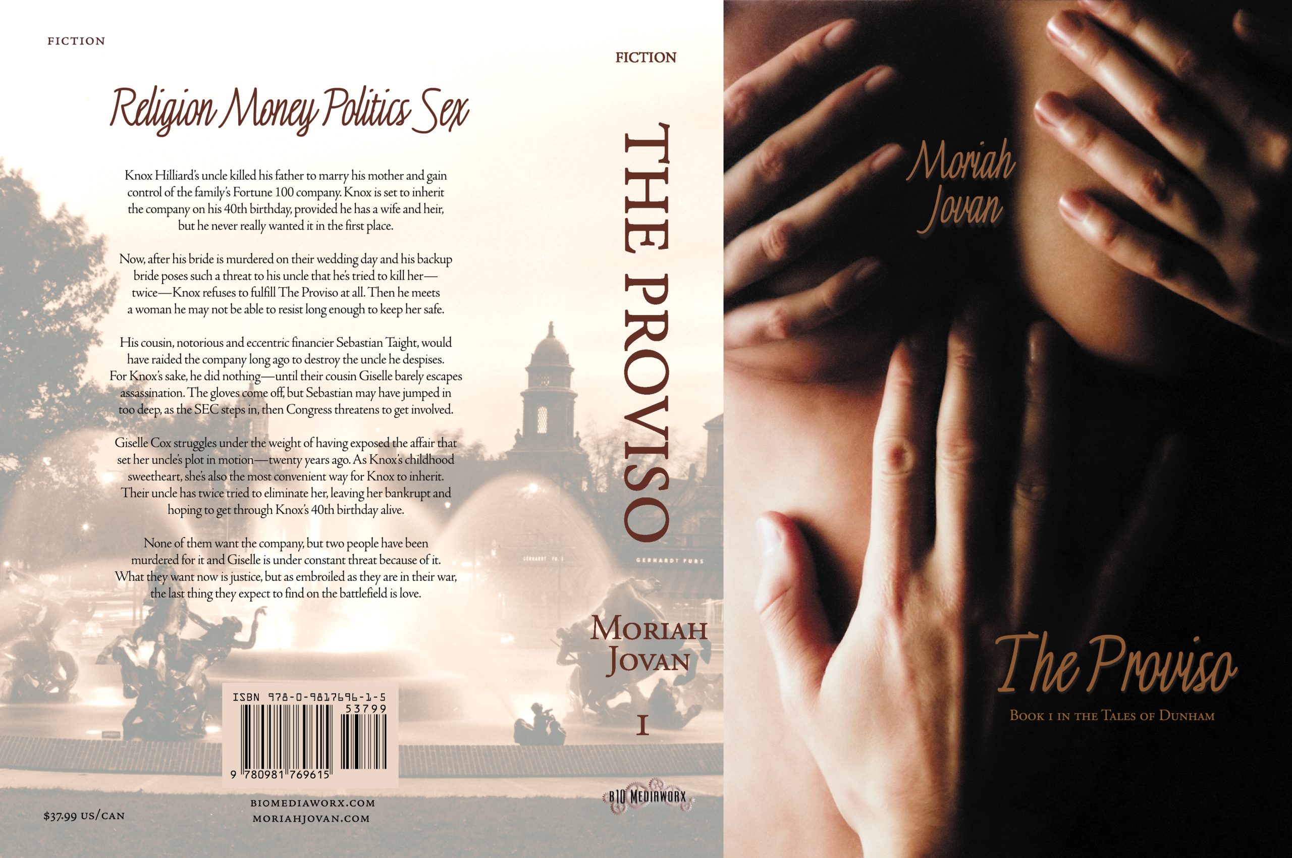 Thank you for your continuing indulgence on the travails of designing a cover if you’re not a designer of covers. As I said last week, it took me almost a year and hundreds of hours of Photoshopping to come to the cover I did, which I affectionately call The Bewbies™. Originally, The Proviso was one book and it was enormous. I originally titled it Barefoot Through Fire. Then I figured I’d probably do better to split it out into 3 parts, 1 part per romance. This is the story of book 2.
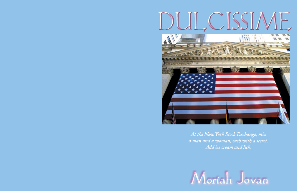
Zoe commented that “Canned Heat” (the original title of book #1) is a favorite song of hers. Well, it’s a favorite of mine, too, and that’s how I came to name it that. It fit the couple. So in keeping with the song names theme, I originally named book #2 (couple #2—so Dating Game) “Dulcissime,” which is an aria from Carl Orff’s Carmina Burana. Trust me, it fit. This cover, however, did not, so … you can see I abandoned that right quick. I remember doing that the same day I did the yellow one (the mostest ickiest one in my previous post).
Well, I hauled out a picture a friend of mine took, which I bought the licensing rights to a gazillion eons ago when I wanted to use it for a different project. (Ignore the purple blotches on the small one and pretend it’s got “Dulcissime” on the front, ’k?) Oh, that was a pretty cover. Showed it to Dude (who was in the midst of reading that particular couple) and he said, “Too girly.” I said, “Yeah, but isn’t it pretty?” He said, “Yeah. That’s my point.” Okay, got it.
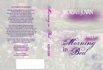
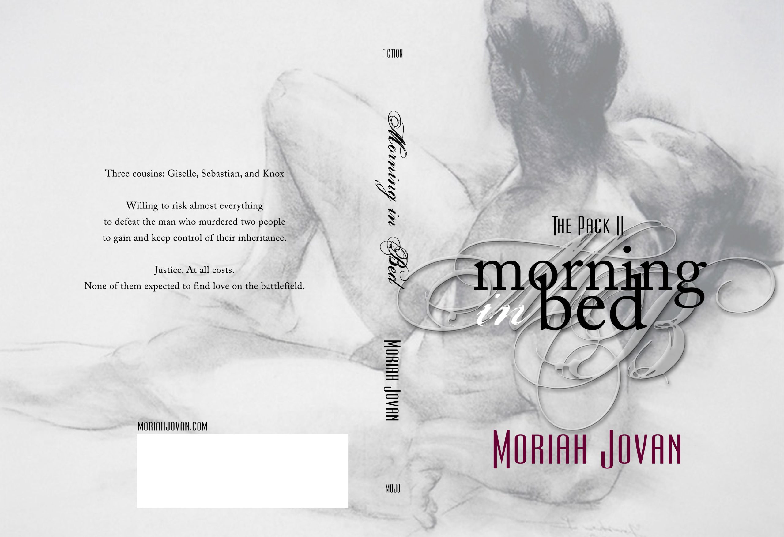
Finally, I decided to ditch the “Dulcissime” (because I’m the only one in the world who’d understand it and once Dude said, “How do you pronounce it?” I knew it wouldn’t work) and went for the ORIGINAL original title of that novel’s concept (which had been a stand-alone bouncing around in my brain for years): Morning in Bed. Now, those of you who’ve read The Proviso will know what this refers to; for those of you who haven’t, I’ll not spoil you. Anyway, see above graphic and explanation.
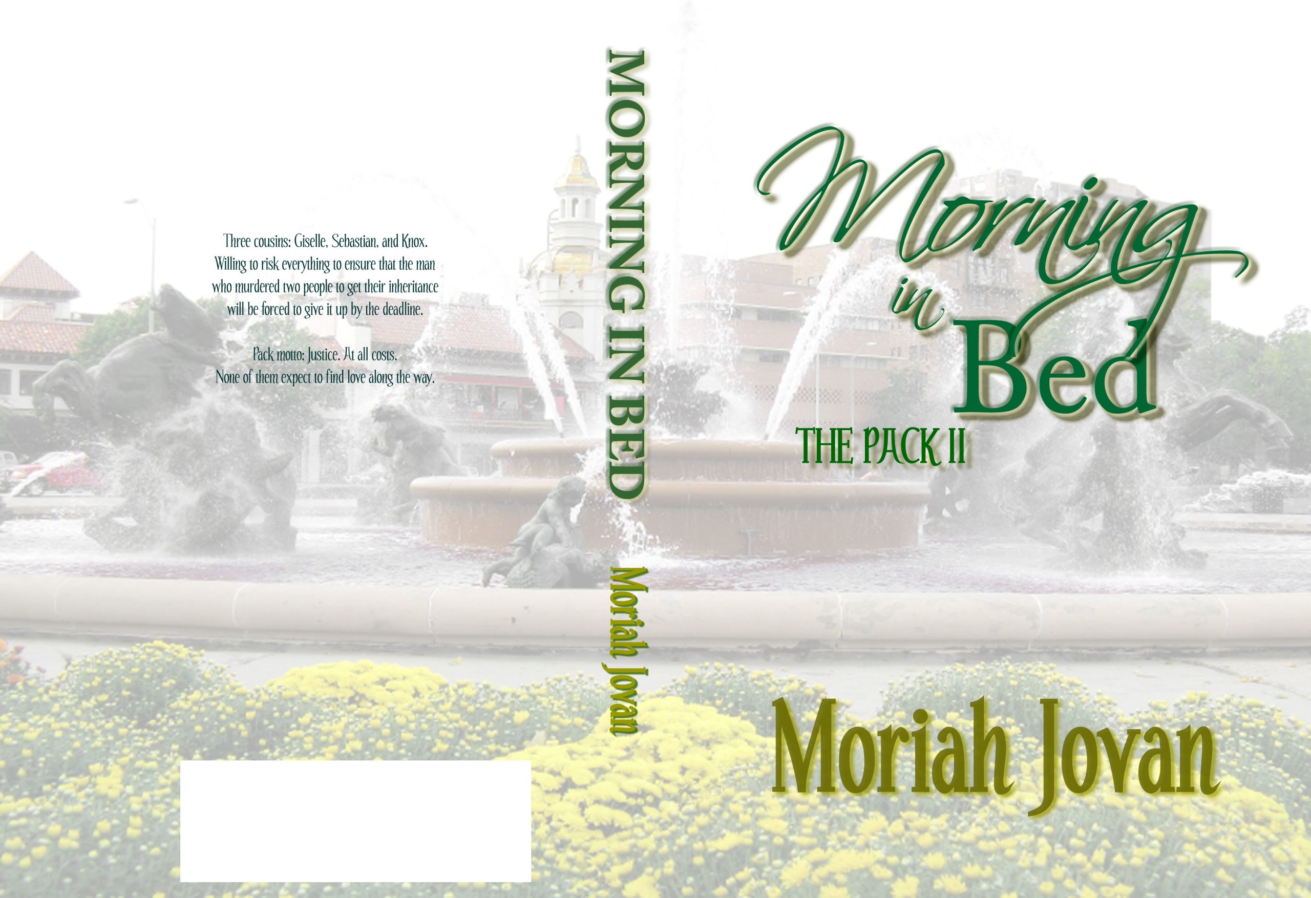
Then I decided to go with a Kansas City theme. Naturally! I showed it to Dude, who said, “Mmmm, yeah, I like it” in a rather unenthusiastic tone of voice. I said, “Okay, what’s the problem?” He said, “It doesn’t stand out. I wouldn’t notice that in a bookstore.”
But this would! And it fits unbelievably well with the story. Problem: It was done in 2002 and is therefore under copyright and, while I was willing to pay whatever I had to pay to get that perfect man on my now-perfect cover with the now-perfect title, I couldn’t find the artist. Anywhere. I called freaking Canada. Twice. You should see my phone bill. Okay, so artist has disappeared off the face of the earth. I wept.
Then it didn’t matter. No matter how much I wanted that art, I couldn’t use it anyway once I decided to reassemble my story under one cover. Like Lilith, this image represented only one of the major characters and I needed something more inclusive. I’m still weeping.
Next week, the covers for couple #3.
Dude still isn’t sure how to pronounce it, and thinks Dulce de Leche whenever he sees it.