This is the final installment on the covers series (parts 1, 2, and 3). I never got this finished for Publishing Renaissance, so this is fresh and new.
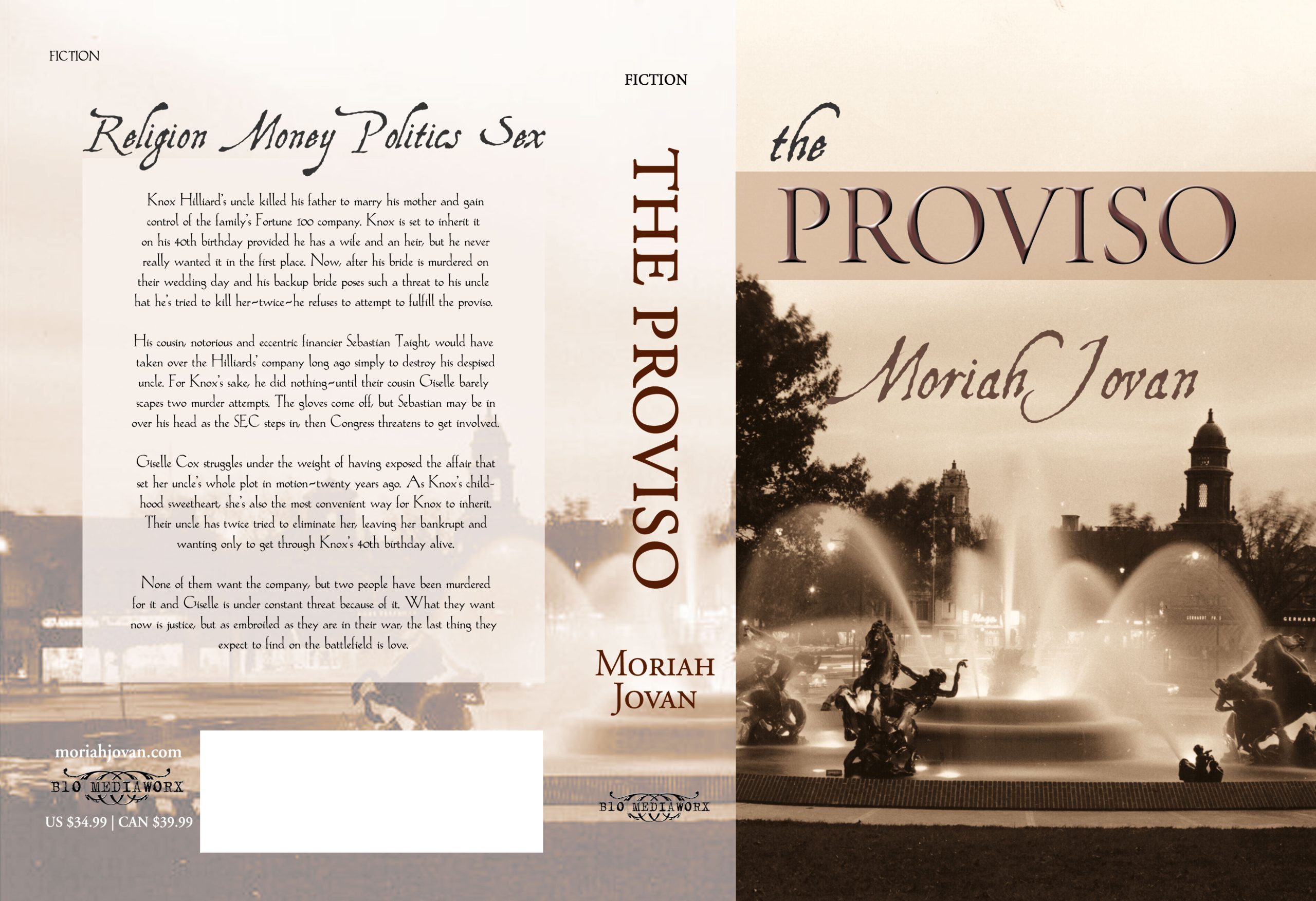
 Thank you for your continuing indulgence on the travails of designing a cover if you’re not a designer of covers. As I’ve said in the past, it took me almost a year and hundreds of hours of Photoshopping to come to the cover I did, which I affectionately call The Bewbies™. Originally, The Proviso was one book and it was enormous. Then I figured I’d probably do better to split it out into 3 parts, 1 part per romance. Then I realized there was no way to write this in three parts without making everybody crazy.
We are now at the final cycle of decisionmaking, when The Bewbies™ perked up.
So I decided to weave all three storylines back together as one big honkin’ epic. One problem: Still couldn’t figure out what to call it. I tried the following: The Miracle of Forgiveness, which is related to the church, then Variations on a Theme of Hamlet: The Rest is Silence, The Play’s the Thing, and then I got tired to trying to think of something thematically clever that encompassed each individual story arc within the greater arc.
The Proviso happened cuz I was just plain ol’ tuckered out. You get that way sometimes.
More importantly, the eponymous proviso directly impacts every choice Giselle, Sebastian, and Knox make—and has for years. By extension, the minute Bryce, Eilis, and Justice show up, the proviso sucks them in, too, and changes their lives completely.
Clever? No. Apropos? Yes.
Anyway, my cover ideas were flying fast and furious and I was changing them as fast as I thought them up. During this time, also, I was also settling a whole bunch of other details about websites, press names, printing vendors, and such, which is why there is such a disjointed look to the finer details of the covers, why some earlier covers have The Proviso on the cover and why later versions didn’t. These covers evolved in the course of about a month until I found The Bewbies™:
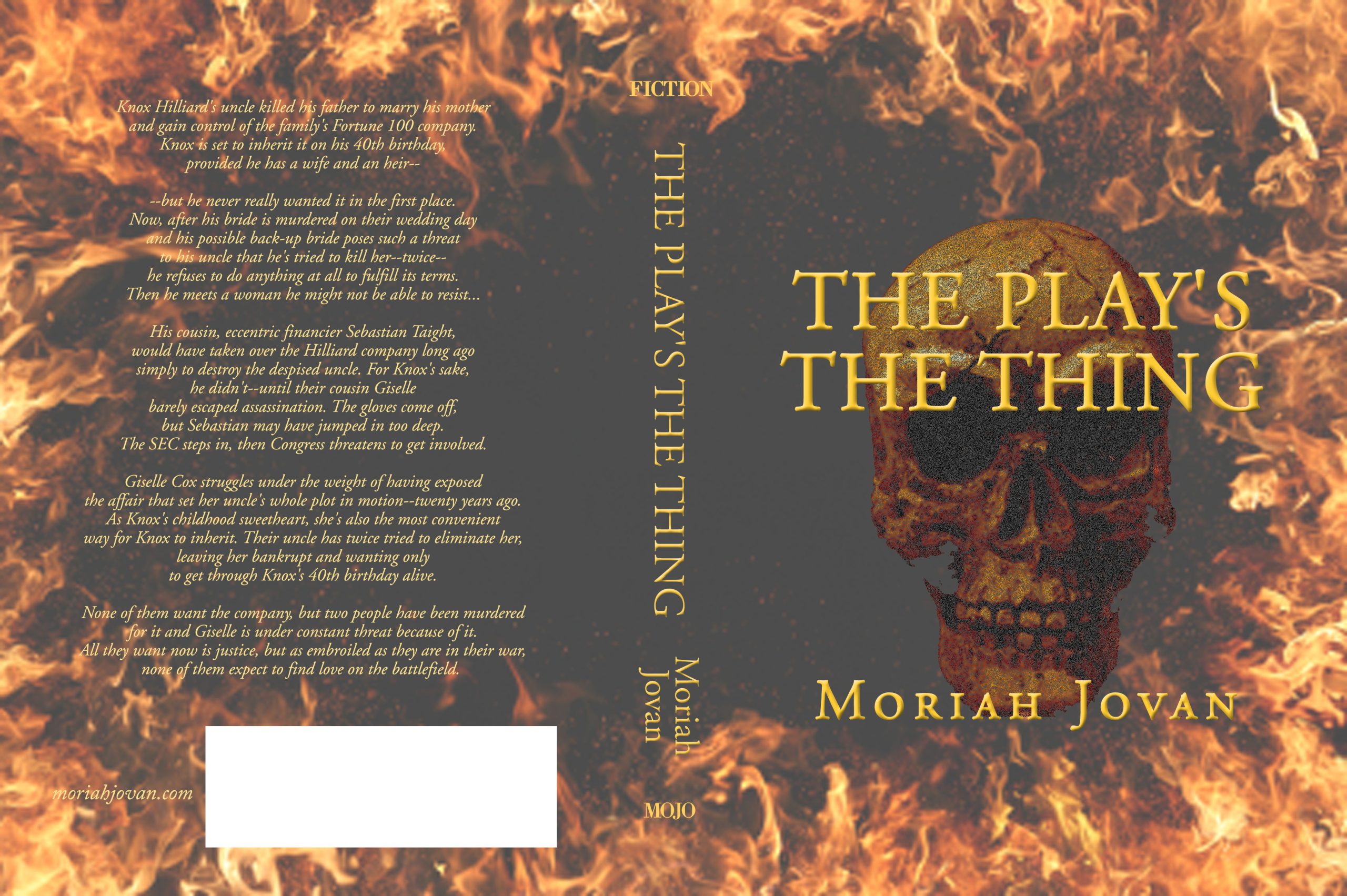
Hamletesque, you know, skull, overlays of blood and the to-be-or-not-to-be soliloquy. The, um, title.
More Hamletesque, except the flames are particular to Bryce (and a little to Giselle), but the book’s not about Bryce; it’s about Knox. (Although some people disagree with me on that!) It had to go. Also, way too over-the-top melodramatic, even for me! (That’s saying something.)
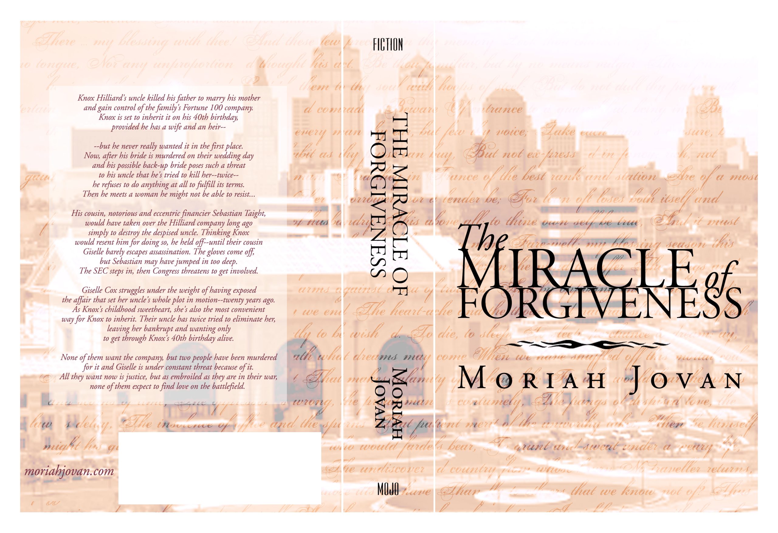
Back to a church theme title overlaid on Union Station, where the last scene in the book takes place, fronting the KC skyline from that angle. But again, the phrase “miracle of forgiveness” is a Bryce theme, although I could stretch it and say it applies to everybody. [Insert rimshot here.]
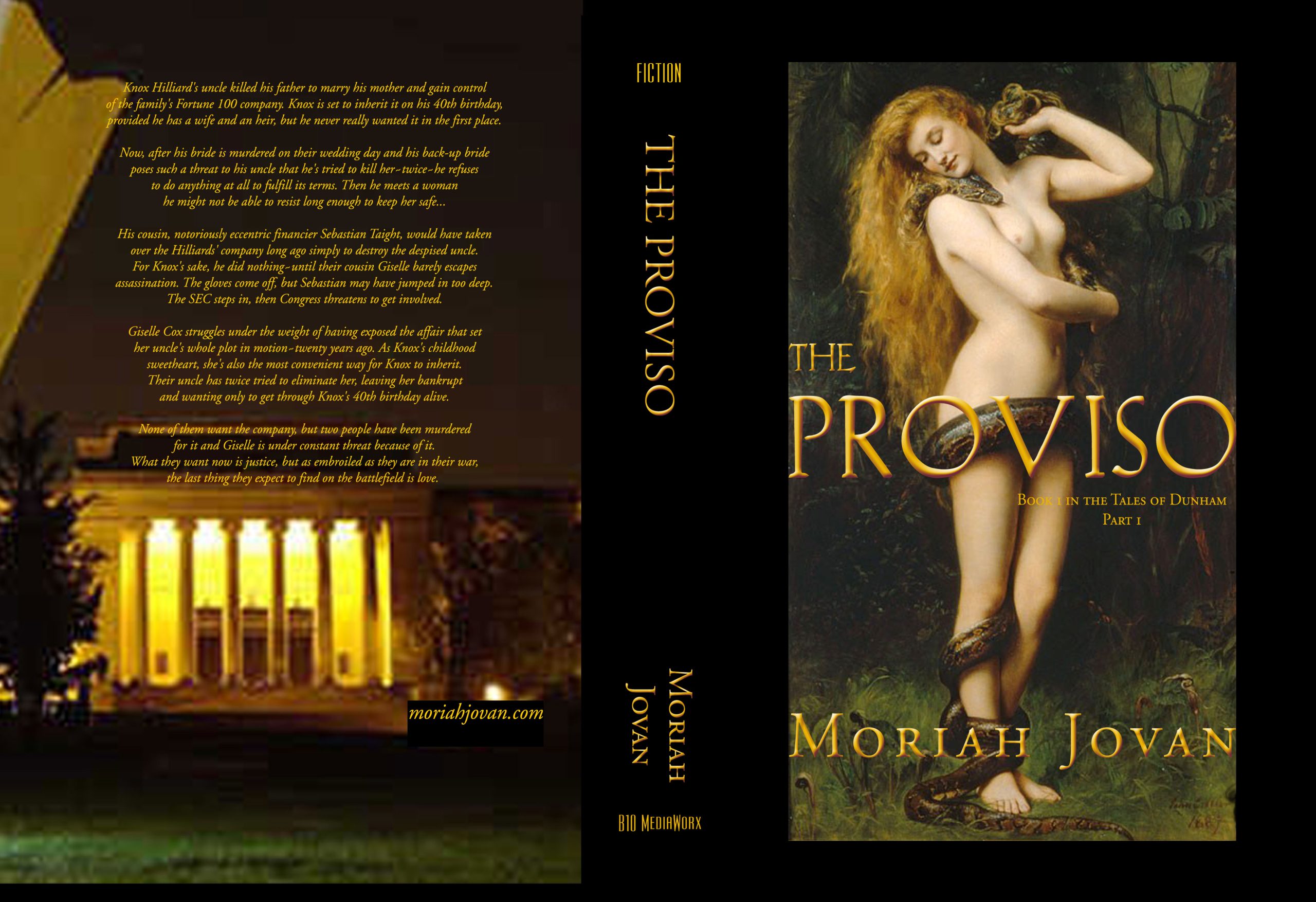
And we’re back to Lilith, but again, it’s too specific to be able to stretch over the whole story, instead of the one couple it really applies to. Plus? This just sucks in about 156 different ways.
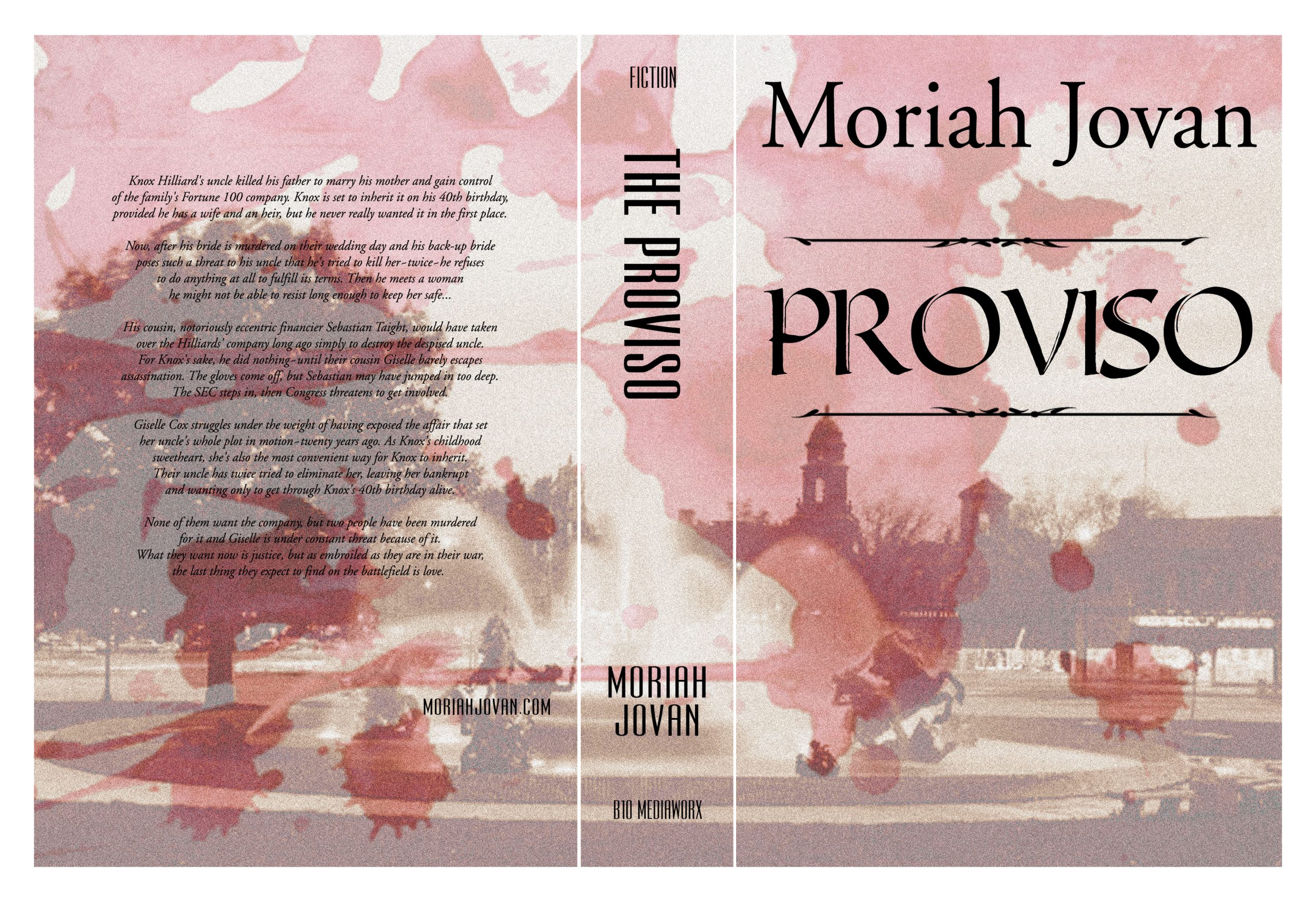
The J.C. Nichols Memorial Fountain, which I was DESPERATE to use in some way, plus a blood-spatter overlay. Yeah, this one didn’t even get to the stage of making a JPG out of it. Until now. To show you. Concept okay. Execution, well, not.
Oh, yeah, now we’re getting somewhere. I played with this for the longest time, showed it to Dude, who said, “It’s nice.” I said, “Okay, what’s wrong with it?” “Well, I wouldn’t pick it up in the bookstore.”
So I sighed and went back to the Photoshop. No, actually, I went to iStockPhoto and resigned myself to spending DAYS and DAYS looking for something that encompassed everything I wanted to say.
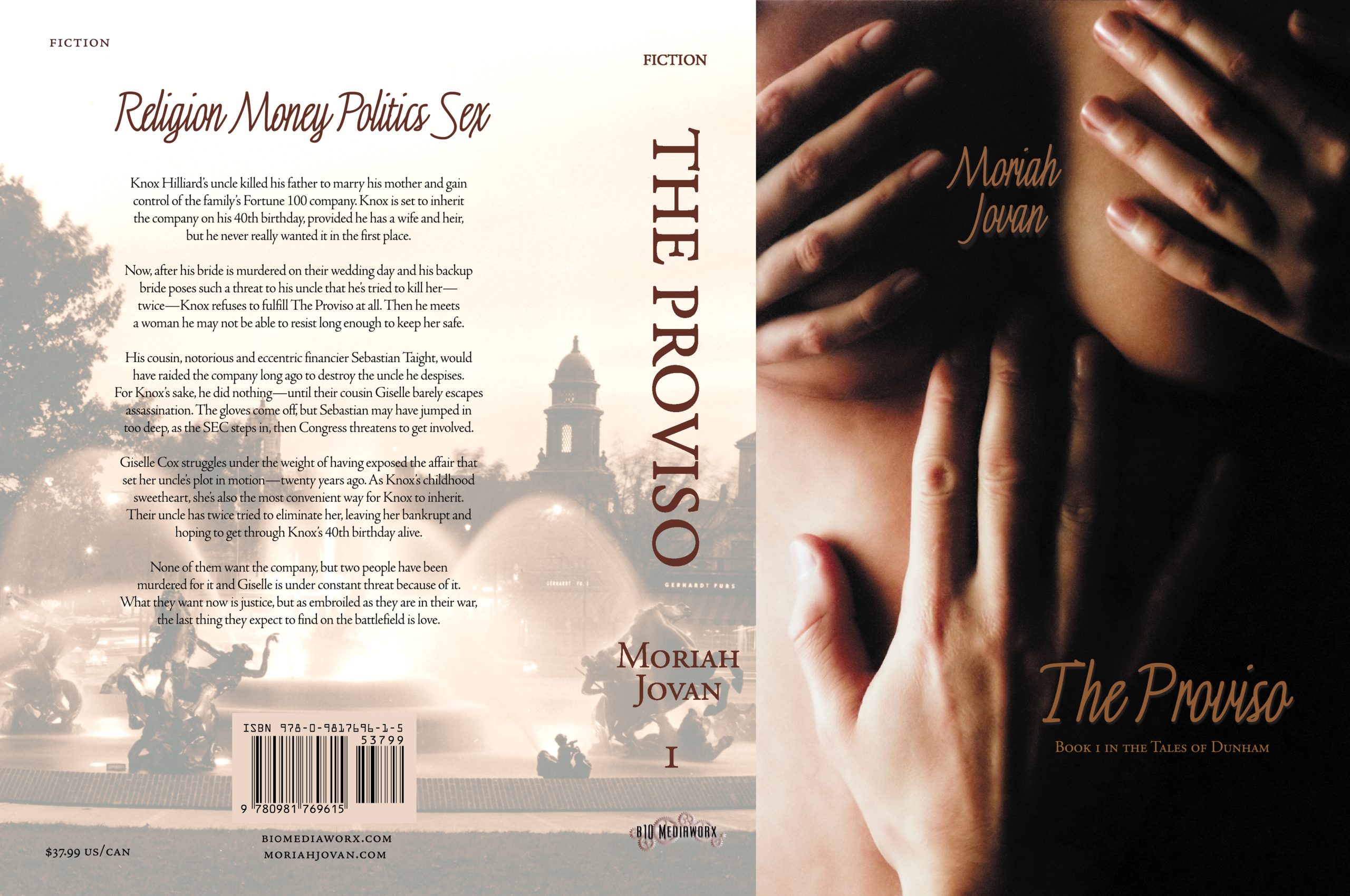
Two days into iStockPhoto, right? I finally run across The Bewbies™ when it had something like 10 downloads. It was perfect on so many thematic levels, and I knew it immediately. My first thought was not, “Does that say what I want?” It was, “Do I have the balls to put that on my cover?”
Yeah. I sure did.
Well, I am not surprised you had the balls to put that on the cover. I think all of your covers are beautiful, but honestly, this last one is the best. I do like the Lilith theme cover, but from the little I know of this book (from your descriptions), I have to agree that it doesn’t fit at all. Dramatic? Yes, but it sends a different message to the potential reader about what kind of story you have. My least favorite would be the first one. Followed by the flame and skull.
So, I like The Bewbies too. LOL
It is surely an attention grabber, and lets you know there is some serious passion going to happen.
Two problems:
The immediate visual take-away is that this is porn. People DO judge a book by its cover.
Unfortunately, you’ll not be carried in may bookstores. It’s shocking to think we’re in the 21st century and people are terrifid of sexuality – specifically women’s sexuality. I can’t think of any Midwest bookstore that would shelve this face out. Too many random widgets would plotz that their “baby” could see it and have “thoughts.”
If you aren’t aiming at bookstores, fine. If you aren’t aimong at the sorts of people who would be offended by this, fine. Your marketing plan and reader-targets are all that matter in the end.
Two last nits to pick: The bar code should go in the right hand bottom corner, not the middle. I’d step down the background of the back cover about 2 more levels. I can tell it’s going to be hard to read the backmatter. Or you can bring up the picture to 100% and make a text box of a complementary color and overlay it on the picture.
Otherwise, I think it’s pretty spiffy.
Regarding the bar code, that was Lightning Source’s template, so it is exactly where it should be. I have no say in that.
Regarding its risqueness, yes, that’s why I had to ask myself if I had the balls to put it on the cover.
Regarding, porn, well, it’s already been called that—although I can tell you that A) that person read the 200-page excerpt and thought it was the whole book, B) that is his sole review anywhere on Amazon [makes me feel very special], and C) he obviously doesn’t read much porn.
You know I like The Bewbies™. I bought the book because of its cover. Bravo to you for having the balls to use it. It doesn’t scream ‘porn’ to me. It screams sex. There’s a sharp difference.
Society is afraid of women’s sexuality. They need to get the hell over it. So does the publishing industry.
Again, not bashing you at all. Merely trying to be a helpful beagle.
I only bring up the “porn” issue because we did a book that got labeled that., so I know the fight you’ll have on your hands. Women in Shadow and Light http://www.janlafontaine.com/womeninshadows.html is about women healing from abuse. The book contains art photos of unclothed women (not bruises and broken bones) and is quite beautiful and uplifting. But none of the big 5 pre-pub revierwers would touch it (I had a friend walk it into the Booklist reviewer’s office and he said “Oh, THAT book.”). None of the women’s advocay groups would touch it. We now call it The Book of Nekkid Ladies in the Victorian Age.
It’s a great, arresting cover. But this is a case of a designer’s mind over matter: If you don’t mind, it don’t matter.
On the subject of Amazon reviews from ejits: this may actually help you. A string on non-confrontational reviews is a minus to many buyers. Adversarial reviews balanced among positive reviews let the buyer know it may not be for them – or may be just the ticket!
And as Christ said, “And the fools ye shall always have with thee…”
Totally understood!
I went to look at Women in Shadow and Light and beautiful, beautiful book! Obviously I like nekkid bodies, but maybe that colors the reason why I don’t understand why anybody would call it porn.
That’s why I pointed to it. It made me laugh, too. I had a review from an “expert” in publishing that flat-out lied about my book, and I don’t point to that because it’s just so factually incorrect. Deliberately so.
>I had a review from an “expert” in publishing that flat-out lied about my book
As an expert in publishing (specializing in helping new publishers), my blood pressure just hit max. I think we should hunt down this fool with a bogus gun and give him/her/it a full-faced blast! We need less poseurs and more reality.
Porn? For that cover? I can see how they might think that, but it’s rather irksome. I’ve seen more provocative covers than this. Bare butts, etc. This photo is very tasteful. It’s irritates me how a woman’s form should be considered porn just for a tastefully done photo. This isn’t remotely like Playboy or Hustler.
I don’t know if you saw the “conversation” I had with someone on Twitter the other day. The man declared that erotica was just women’s porn. I knew arguing with him was pointless, but let him know that there was a big difference between porn and erotica and his statement showed his ignorance of erotica. (grin)
I wonder what he thinks of romance. HAHAHAHA Naw, not really. 😉