And it’s ugly, too.
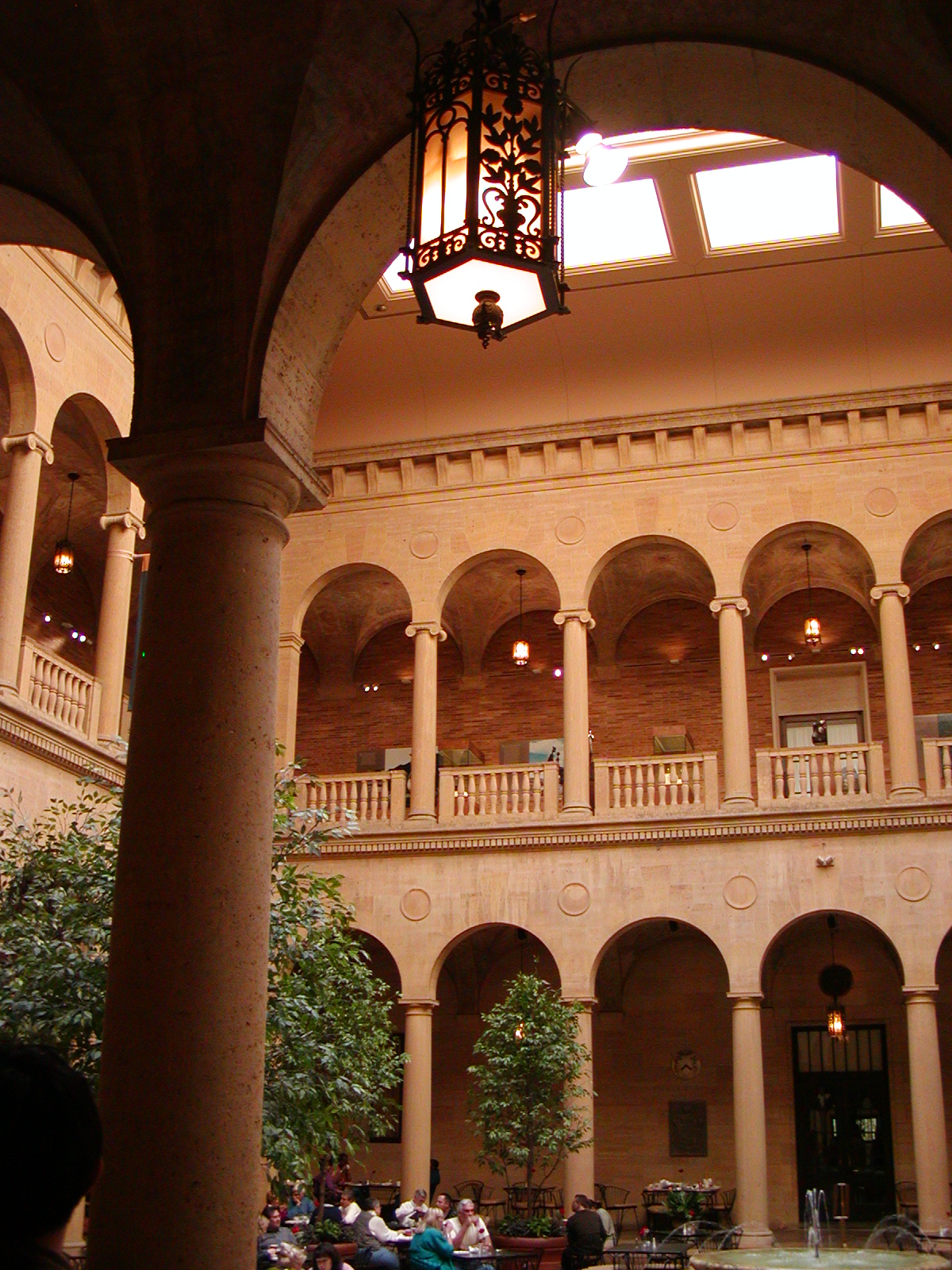
The Nelson-Atkins Gallery of Art is one Kansas City locale that plays a fairly significant role in The Proviso. I mean, the whole city is rather its own character (or at least, I tried to make it so), but this one spot, I think, plays the most parts other than “Chouteau” County and its pretty courthouse and The Country Club Plaza. It hosts a senatorial fundraising party, it’s where one of the female protagonists goes to meditate, and it’s the gallery chosen to premier a new painting by an infamous artist.
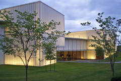
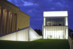
Anyhoo, I see on BlogKC that the gallery’s having to cut back like everybody else. Well, you see, the difference this time is because of that, uhm, $200M construction trailer brilliant Steven Holl masterpiece called the Bloch addition that they built next to the neoclassical structure.
Time called it the number one “(New and Upcoming) Architectural Marvels.”
Adding a new wing to a neoclassical museum, Holl devised a spectacular update on classicism: an irregular series of volumes that cascade down the museum’s lawn and glow from within. The effect against the nighttime sky is nothing short of magical.
If you say so, but I’m just an ignernt country rube who obviously doesn’t know brilliance, especially when it cost more than it was ’sposed to. And why are all the kudos about its brilliance coming from people who don’t live here?
(Poor Rodin. They displaced The Thinker.)
Now, three problems with this thing.
B. It’s expensive to light (because, you see, its only marginally redeeming architectural feature can only be seen at night when it’s lit).
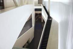
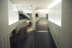
C. It’s the most inefficiently designed interior space I’ve ever seen.
So what is one of the things they’re having to cut? The hours and the lighting. And I’m telling you, folks, in the daytime, without the lighting, it looks like a construction trailer/storage shed.
Now, I’m not going to be one of those people who would start crying if they began to charge admission, because, well, it’s a very prestigious gallery in terms of its collection and yeah, I’ll pay to get in. And I know they’re not going to knock the damned thing down especially since they spent so much money on it.
But I just need to poke a stick and say, you spent a whole lot more money than you thought you would on something the citizenry doesn’t really like and now you can’t pay to make it do its featured thing that somewhat redeems it.
Enjoy. Or don’t. If you live here and you feel me, meet me in the Rozzelle court (closed Tuesdays now, remember!) and we’ll commiserate.

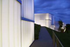

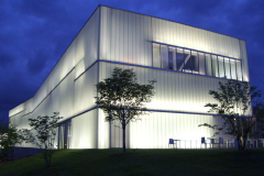
construction trailer/storage shed is a good call.
I alway thought it looks like a pre-fab Butler Building . . . But I like your analogy as well. I’m linking.
It’s funny to the point of ironic that ALL the reviews of the structure I’ve seen show the building only at night. Of course, with the cutbacks, now they couldn’t even do that.
Tony, WOW! Thanks bunches! I’ll get you a link here, too.
DKC, you know, I was thinking that last night when I posted and simply forgot. I may have to mosey on down that way with the Tax Deductions and take some pix in daylight.
Honestly? I’d like it if it were somewhere else in the city. Like, oh, the airport.
Crap. I waded through this whole thing to declare this does not, in fact, look like a trailer, but one of those prefab hangars you see at the airport. All that’s missing is the guy on a tug, circling the tarmac to park your plane and fill the tanks. Now everyone’s already said all that and I can’t even feel clever about it.
This place is the one thing I miss about my year in MO, so I’m bummed. How this monstrosity came to be situated in the midst of the Nelson is on a par with Sarasota’s bogus “season of art” (they forgot the F), wherein modern atrocities like the giant fiberglass molar are foisted upon us at the bayfront for months. Kind of makes me wonder why I argue against cutting art subsidies.
Hey, you! Bout time you showed up. 😉
I have to admit that I remember the brouhaha in Paris over the pyramid built in the middle of the Louvre courtyard, which was still being built when I was there. Now, construction mess aside, it looked as clashy to me as this nastiness does next to the Nelson.
On the other hand, it looks pretty in this picture and I wonder if that’s what out-of-towners think when they see the
construction trailerairplane hangarBloch addition.Oh, I read–it’s just a combination of not wanting to embarrass you AND not needing another internet addiction. 😉
I considered the Louvre, but in the end I think that’s not at all the same because the French actually have a history with Egyptian antiquity pilfering, so that doesn’t look so out of place. Or maybe it’s that it feels kind of appropriate, like a Victorian garden curio. And you can see through it, so it’s not so in your face as the two-hour garden shed.
I somehow don’t think you can make the same stretch for a hangar. Or maybe I’m biased because I live in the land of prefabs, where the fundie churchgoers seem to think a massive garage is a great step up from renting a storefront at the strip mall. I’ve lost count of the buildings just like this that have sprung up in cow pastures and spent orange groves. The only thing missing is a giant cross on top and a sign out front declaring, “Who needs brick and mortar when god’s happy to pull up a folding chair and join us inside?”
Well, maybe they’ll reserve this thing for the modern “art” and you can avoid it all in one fell swoop. 🙂
Okay, I’ll give you the Egyptian antiquity pilfering, ’cause damn good call.
And you cannot embarrass me!
On first view, this thing reminds me of 2 things – that trailer that is called the Clinton Library in Arkansas that hangs over water (do you ever wonder when it’s going to fall in?), and the hallways of the Enterprise in STNG. I’ll embarrass her for you, Haggis.
Tallulah! Good gravy, my friends are coming out of the woodwork.
Next it’ll be my family. RIGHT? RIGHT? AL and CL, I’m looking at YOU.
LOL, Tallulah–the sad fact is she KNOWS I can embarrass her. I don’t know if we’re talking masochism or thrill-seeking. In my misspent youth, if I got caught doing something outrageous, I had great success blaming it on my twin cousin. Maybe it’s something like that. Or maybe it’s that idea that you can’t have good without evil and an unruly pal helps provide some contrast. 😉
Ah, well. I can’t really embarrass my kids these days, so prolly should branch out.
For now, I need to go research the bogus Enterprise. I may find a clue as to why I never fully made the jump from TOS, but I suspect it’s the same reason I’m locked in the Tom Baker years of Dr. Who–as much as I embrace new technology, there are some things that just shouldn’t go there. Sometimes, that primitive presentation is part of the charm.
And sometimes, trying to embrace what you think is sleek and futuristic just ends up looking like a place for the 4-H to set up their entries for the county fair.
Maybe if they loaded this place up with Dali, it might start to make more sense to me. . .
Oh dear. This is a crying shame:
I have a hazy memory of a lovely day at the N-A. I hope the addition has redeeming features in daylight as well as when lit. (Redeeming as in, both aesthetically and fiscally.) Maybe it could be a butterfly pavilion in the spring 😛
RfP! Come back and look me up and we’ll make a day of it. I still love to go, even though it’s been defaced.
No, its exterior is detracting in daylight and doesn’t redeem anything. I really don’t think Howard Roark would have approved of this.
It’s really too late to cry about it, but it’s really jarring when you drive up the east side of the gallery and see it.
I need to go back and read From Bauhaus to Our House: “O beautiful, for spacious skies, for amber waves of grain, has there ever been another place on earth where so many people of wealth and power have paid for and put up with so much architecture they detested as within thy blessed borders today?”
And you know, I’m a total fan of Mies van der Rohe and I can appreciate Frank Lloyd Wright.
This…construction trailer…I don’t get it.