That awkward moment when you’re a book designer and you design your own books and the print is even too small for you. (The re-do added 100 pages to it.)
Never underestimate the commercial value of mental illness.
That awkward moment when you’re a book designer and you design your own books and the print is even too small for you. (The re-do added 100 pages to it.)
Get a professional editor.
Period.
No excuse.
I don’t care how good your beta readers and critique partners are.
I don’t care if you’re a traditionally published midlist author going out on your own.
Get a professional editor.
You want to self-publish? Put in the time and the effort and the money, just like a big publisher would. This is a business and you are creating a product to sell to people. Give them a good product.
That product begins with a professional editor.
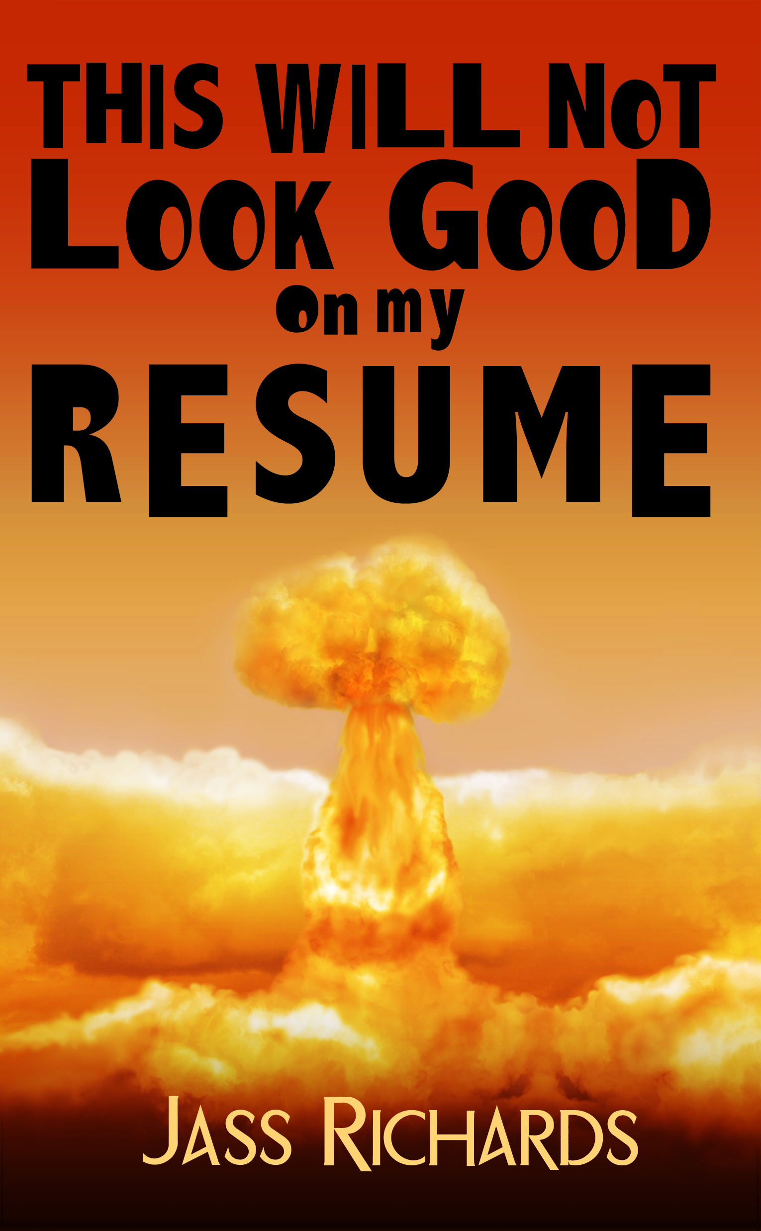 If you want some droll (adult) humor, go buy this. Seriously. It’s the funniest thing I’ve read this year, and I’m not sure, but it may be the funniest thing I’ve ever read, period.
Amazon (print or Kindle)
Smashwords
“Everyone gets fired at least once in their life. And if not, well, they’re just not trying very hard. And we all think of brilliant and immature ‘shoulda saids’ and ‘shoulda dones’ for weeks after. (Okay, years.) In this collection of loosely related stories, Brett shows again and again that getting fired is really quite easy.”
You will notice I haven’t been posting much at all, much less my thoughts on ebooks and publishing. Wanna know why? I’m too busy with my burgeoning business to put any thought into a) what’s wrong with publishing (because why do I care?); b) how to go about formatting ebooks (because that changes week to week); and c) wondering if I’m ever going to get my historical swashbuckler researched and written (because I’m a writer, dammit!).
In case anybody cares, these are my current random thoughts, none of which rate the time to explore in a full-on blog post (plus, I’ve said it all before):
1) Writers: You’re screwed unless you put out your own stuff and you can market it. The old days are gone. “Getting” published is fine if that’s what you need to validate your soul. If you want better odds on getting to readers and making a little money, do it yourself. But dammit, do it right!
2) Writers: Remember that the people who made money in the gold rush didn’t make it panning for gold, chasing a vein that didn’t exist. The people selling the shovels made all the money. Learn a new skill and sell some shovels. You aren’t going to make a livable income writing for da man. Just don’t make any plans to leave your day job.
3) Book designers: Stop trying to format ebooks on a print paradigm. Ebooks are not print books. They don’t serve the same function. It’s like trying to apply a print paradigm to audiobooks. Stop it. Learn how to format serviceable, good-looking ebooks and forget about Teh Fancy.
4) Editors: Go freelance. Market your name. Make the authors who hire you put your name in the book so you can establish your brand. The curation of books in the future will depend on the editor, not the author, not the publishing house.
5) Indexers: You have a bright and shiny new field to explore. Learn how to index digitally. It’s called anchor tags.
6) Publishers: Get your metadata in gear. Seriously.
7) Publishers: The first publisher to chapter-and-verse its digital textbooks/reference/nonfiction will win the prize. What do I mean? I’ll tell you. Pick up a Bible. Any Bible, any translation, any size, any publisher. Go to John 3:16. That’s what I mean. Develop a system. Patent/trademark it then license it. Make it the standard of any good digital nonfiction book, the way good indexing is. Indexers, see #5.
That is all. I have a mountain of work to get done before I leave for NY next week.
This is the final installment on the covers series (parts 1, 2, and 3). I never got this finished for Publishing Renaissance, so this is fresh and new.
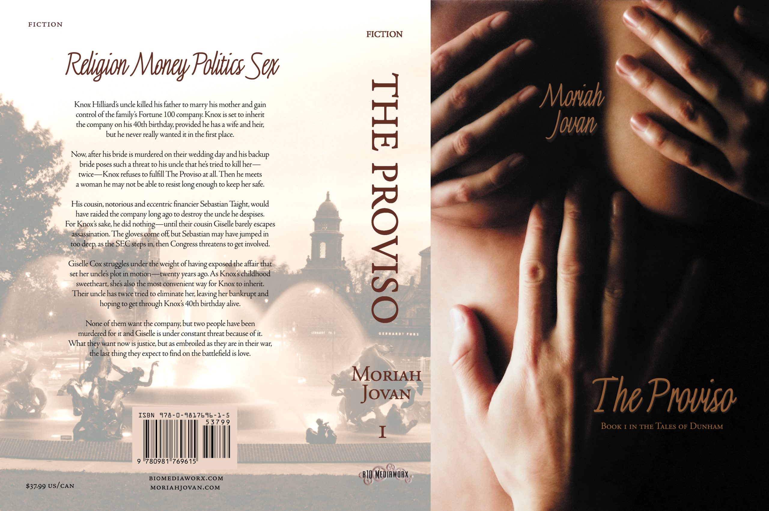 Thank you for your continuing indulgence on the travails of designing a cover if you’re not a designer of covers. As I’ve said in the past, it took me almost a year and hundreds of hours of Photoshopping to come to the cover I did, which I affectionately call The Bewbies™. Originally, The Proviso was one book and it was enormous. Then I figured I’d probably do better to split it out into 3 parts, 1 part per romance. Then I realized there was no way to write this in three parts without making everybody crazy.
We are now at the final cycle of decisionmaking, when The Bewbies™ perked up.
Read more
★★★
Thank you for your continuing indulgence on the travails of designing a cover if you’re not a designer of covers. As I said last week, it took me almost a year and hundreds of hours of Photoshopping to come to the cover I did, which I affectionately call The Bewbies™. Originally, The Proviso was one book and it was enormous. I originally titled it Barefoot Through Fire. Then I figured I’d probably do better to split it out into 3 parts, 1 part per romance. This is the story of book 3.
Read more
★★★
Thank you for your continuing indulgence on the travails of designing a cover if you’re not a designer of covers. As I said last week, it took me almost a year and hundreds of hours of Photoshopping to come to the cover I did, which I affectionately call The Bewbies™. Originally, The Proviso was one book and it was enormous. I originally titled it Barefoot Through Fire. Then I figured I’d probably do better to split it out into 3 parts, 1 part per romance. This is the story of book 2.
★★★
If you’ll all indulge me, I though it’d be fun to do a little series on the evolution of a cover by a non-cover artist/designer. It took me almost a year and hundreds of hours of Photoshopping to come to the cover I did, which I affectionately call The Bewbies™. Originally, The Proviso was one book and it was enormous. I originally titled it Barefoot Through Fire. Then I figured I’d probably do better to split it out into 3 parts, 1 part per romance. This is where the cover journey begins.
Yesterday, I got a little mouthy (see this post), which will surprise no one.
I was sent an EPUB file that had embedded fonts that rendered perfectly in ADE. I cracked the file open and what did I see? Perfection. The file wasn’t bloated, it was neatly organized, the CSS sheet was reasonably tidy for its detail, and the detail was compact. It worked and it worked beautifully. I can see how it’s done.
In Sony Reader, it mostly rendered the way it was coded (still no full justification).
In FBReader, it did not render the way it was coded at all.
I then cracked open The Proviso file that BookGlutton made. It was a lot leaner; granted, I didn’t have embedded fonts, but it still rendered nicely.
Then I cracked open the file of Stay I had made as an experiment using Atlantis, and it was lean, albeit not as lean as The Proviso because Atlantis broke out each chapter as its own file.
Both The Proviso and Stay look “nice” in ADE, Sony, and FBReader (insofar as anything looks nice in FBReader). That’s right. They look nice. Not spectacular. They do not have Teh Pretteh.
And you know what? That’s okay. I can see that Teh Pretteh EPUB file would take a whole lot more work than I’m willing to invest in either time to hand code or money in software that will do it automatically. I simply see no return on the investment of the extra time for Teh Pretteh with the tools that are available now. I have no doubt that those tools will become available in time.
I’m selling a $40 736-print-page book in 8 ebook formats for $6. The print version is Verra Pretteh, as is the PDF file that comes in the e-book file your $6 buys you. But let’s be real. People who seek out and read e-books—especially on an iPhone, SmartPhone, Kindle, or dedicated reader—are doing it for the content.
After basics: full justification, paragraph indents, line spacing, chapter breaks, a hyperlinked table of contents (and other hyperlinks, if necessary), and those conventions of book reading that move the reader seamlessly through the text, anything else is a waste of time.
Why? Because at the price point that is acceptable to an e-book reader who believes that e-books are cheap to produce and should, then, cost a whole lot less than print books, either A) hand-coding Teh Pretteh or B) purchasing the software that will run Teh Pretteh yields little to no return on investment.
So mea culpa for saying it can’t be done.
No mea culpa for saying it’s a waste of time to do it.
For now.
Backstory for those non-e-book types out there (hey, the non-Mormons get backstory when I post on Mormon stuff, so deal):
So finally my issue with Apple’s getting some play, which is to say, over at The Future of the Internet and How to Stop It blog.
Author Moriah Jovan had a book rejected last month on that basis (although the rejection didn’t mention the book’s more creative obscenities).
Let me be clear about one thing. My other obscenities are no more or less creative than the average steamyhawt romance novel. In my opinion. However, if the steamier novels could make the cut because of the absence of the F-bomb, then yet another level of hypocrisy will have been reached. (I’d be interested to know what, if any, romance novels get converted to apps and put in the store.)
The article talks about the difference between rejected apps that are NOT e-books because e-books do have an alternative method of distribution to iPhone. (Ahem, my book is available through the Smashwords/Stanza catalog.) Anyhoo, I’m hearing that there is absolutely NO organization to the iApp store, so maybe it doesn’t matter anyway.
Except, you know, my cover Bewbies are totally eye-catching, no?
I’m over at Publishing Renaissance today, blogging part 3 about how The Bewbies™ came into existence; in case you missed them, see part 1 and part 2, too!
April Hamilton, independent publishing crusader extraordinary, built a new site called Publetariat, which will serve as kind of a clearinghouse/gathering space for independent-like authors. As soon as I figure out the Nixonian Drupal (you know, tricky dicky), I’ll be adding my voice over there. At least, uh, that’s what I’ve been s’posin’ to do for a while now and haven’t gotten to it. I’m sure April will find a suitable punishment for me.
The O’Reilly Tools of Change for Publishing conference went on earlier this week and I followed the comments on Twitter. Fascinating! although I’m not sure any conclusions can be drawn in any direction. Frankly, it seems to me nobody really knows what the hell’s going on in publishing right now. I will just keep on keepin’ on. By the way, a free e-book rundown of the conference is available for anyone who wants one.
A lot of what I saw related to the creative monetization of fiction, which ties in perfectly with The Urban Elitist’s and my cross-blog series on the same.
The EPUB format drum continues to be beaten and pleasepleaseplease, PTB, do IT! All for one and one for all! The mp3 format of e-books. I cannot tell you how I salivate at the thought.
DRM was preached against as the Great Satan (which it is).
The guy behind the Espresso Book machine spoke. I don’t know what he said, but check out this video.
Some of my independent publishing cohorts and pals had a session. I wish I’d been there!
I’m coming to the conclusion that it will be another few years before e-books are widely read and that at that point, the value of the print book will be in POD pretty, well-made editions, hardback with gorgeous jackets and/or the ability to offer leather-bound and tooled editions or other specialty editions, where the object of the book is the art as well as the content. Until then, the market’s going to be in flux with regard to price, from free to outrageously overpriced. (I’ll blog this later; I have lots to say about this.)
In other news, the XY Tax Deduction went rooting in the cabinet and brought me a can of corn to make for him. So I did. He said, “I not hun’ry.”
NOTE: This is the third in a series of several posts David Nygren of The Urban Elitist and I will be cross-blogging concerning the issue of authors (whether traditionally published, e-published, or self-published) actually getting paid for their work.
Outside of David’s and my continuing exploration of how to monetize our work (and for me, this means fiction), I’ve come across some interesting things that really only cement my opinion that, in a misguided attempt to be generous, knowledge is flung around like rotting leaves on a late fall day: plentiful, soggy, and seemingly worthless.
In ages past, knowledge was specialized and carefully husbanded, passed down from father to son or from master to apprentice, under the craft guild’s auspices: tailoring, goldsmithing, masonry, jewel cutting. These trades were respected, well paid, and each had their—get it?—guild to watch out for the trade. (I won’t go into the differences between a guild and a union at this time.)
 Not that long ago, esoteric specialized trades with their own secrets began to write how-to books. I still liken this to the groundbreaking This Old House (and if you don’t know how groundbreaking this was in the building and remodeling industry, you just weren’t paying attention or you weren’t born yet). In 1979, I was 11 and I ate it up, glued to PBS every Saturday morning. (There’s a genome for DIYers, you see.) Still, the how-to books got bought and people learned these things—and they paid for the privilege.
A couple of years ago, I thought I’d undertake the task of making drapes, so I bought (oooh, there’s that word again) an e-book on the subject. It was self-published, an A-to-Z how-to with simple instructions laid out for an idiot ADDer like me, and far superior to anything I’d seen in a bookstore or at the library. It was $24.95 and worth every penny. (Never did get around to doing the drapes, but now I understand the concepts and principles of drape-making.)
Today, I went looking for how to create dollhouse plans and build a dollhouse. Now, I have never been into dollhouses and this project has to do with my current WIP, Stay, for which I want to build Whittaker House (a gothic revival mansion inn) and its surrounds in miniature. And I found this: FREE dollhouse plans and instructions.
I would’ve paid money for instructions like that, perhaps as an e-book or as a serial or a do-along project. I mean, she seems to know what she’s talking about, right? I wondered, “What’s wrong with that woman?”
 But then I looked at the header of my own blog, where it says, CREATING E-BOOK SERIES. I’ve been spending hours and hours building the next post on this (in case anybody was wondering where the hell it was). What’s wrong with that woman in the mirror?
Three things:
- I’m a dilettante. I’m not sure I’m doing this the “right” way. I can only share what I’ve done; thus, I’m not sure my knowledge is actually worth anything.
- I like to teach, and any bit of knowledge will spur me on.
- I’m a compulsive helper. Knowledge is power and I think there are a lot of people out there who could use some empowerment.
If I had a penis and had gone to a master to teach me, say, stone cutting, my father would have paid the master to take me on as an apprentice. I would have served in his household in whatever capacity in exchange for room and board and knowledge for a period of 7 years (or more), which would have made me little better than an indentured servant. And then I would have struck out on my next phase as a journeyman and continued training. Once I earned the title of master under stringent training and specification, I could then say, “These are my credentials because I gave 14 years of my life to my trade in money, blood, sweat, and tears, and I am now in a position to charge money for my expertise and get my own little slave.”
If I had gone to college and enrolled in their fashion program, I would have paid tuition and gained credentials that told people, “Yeah, I kind of know what I’m talking about, so you need to pay me for my knowledge.” Oh, wait. I did do that. And I have a couple of awards to show for that. In my particular field of textiles, I’m considered a bit of an expert. So I charge.
But I didn’t go anywhere to learn how to create e-books. I learned my CSS and (X)HTML on my own from the free sites online (which sites exist in order to promote a standard markup). I learned the software programs by hit-or-miss. Nobody taught me; I didn’t ask anybody to teach me. I don’t feel I know enough to charge.
So why am I doing it?
To get traffic here into my blog to get you to buy my book. I am an expert on the subject of The Proviso, so I want to get paid for it. I am fortunate in that a couple of people have mostly agreed with me on my level of expertise.
Rightly or wrongly, some knowledge has to be given away to entice you to buy my product. Sometimes, those enticements don’t seem related. Obviously, there are some problems with the method I’ve chosen, which is to say, the people most likely to show up here to take the knowledge I’m offering free are probably writing books of their own and I should view them as my competition. They probably view me as their competition, too.
But say I’m wrong and it’s painfully obvious to everyone (except me and the people who take my advice) that I have no clue what I’m doing. Well, then my competition will screw up, too.
Sometimes free isn’t worth what you paid for it and can actually cost you a whole lot of real time and cash.
 Okay, so remember where I said I wouldn’t put The Proviso on Smashwords because it had special formatting and boo hoo hoo?
You know what? I’m a capitalist-pig whore1 and I’m full of shit, too.
Smashwords partnered with Stanza and Stanza’s iPhone store, so naturally I got over my formatting/design hubris immediately and figured out a way to do all my special little touches with your bare-bones Word settings. So, yeah. Apple, bite me. Or rather, let me bite you. The Proviso is now available on your iPhone/iTouch at the Stanza store via Smashwords in EPUB, LRF, MOBI/PRC, PDB (the PalmDoc source file, not the eReader container), and PDF. You can read 30% of it free there, too.
But, erm, be patient. Their servers are very popular at the moment.
Yay Stanza and a big THANKS! to Mark Coker and Bill Kendrick for going out of their way to help me.
______________________________
1. Yeah, I know it was redundant and probably went without saying anyway.
I AM AGAINST DIGITAL RIGHTS MANAGEMENT (DRM). ANY VENDOR I RECOMMEND WILL SHARE THIS STANCE AND ANY INSTRUCTIONS I GIVE WILL IGNORE ANY POSSIBILITY FOR ENCRYPTION. IF YOU WANT TO LOCK UP YOUR WORK, FIGURE IT OUT YOURSELF.
In my last episode, I instructed you to go learn (X)HTML/CSS. I was gently taken to task for that with the point, “writers shouldn’t have to learn code.” While I am of the opinion that for some writers, this is not only true, but that they should be kept from any computer interaction whatsoever, I’m afraid it’s just not realistic in the long run. You will learn something, even if it’s only the paragraph tags and all of it will be useful to you at some point.
Yes, you can use blogger.com or wordpress.com or any other sign-in platform for your blogging.
Yes, you can use Word and PrimoPDF to set type and distribute your work as a free PDF.
If you want to:
you’re going to have to either pay someone to do it for you or learn how to do it yourself.
There are quite a few places that will help you with #A.
FEEDBOOKS. As far as I can tell, if you use this service, you must offer your work for free. If this is not acceptable to you, just don’t use their service. (And if this isn’t true, let me know because I scoured the site and couldn’t find any “payment” type information.) Also, you must manually build your book. Now, this has its pros and cons. The con is that it takes a while. The pro is that you can make it look purty with a little care and attention without having to learn much (if any) (X)HTML/CSS.
BOOKWORM. This is a peculiar service in that you may upload your own book, but the only format you get is the EPUB format. It is also more for reading than publishing (as far as I can tell; more information on this is welcome).
SMASHWORDS. This is the Q-DOS of e-book building/formatting. It’s very quick. And yeah, sometimes it’s dirty, especially if you don’t format your Word document correctly (as in, according to standard word processing practices and to Smashwords’s style guide). That’s the con. The pro is it’s fast and you can charge for your work.
I’m making several assumptions here. The FIRST assumption is that you want your book to be in as many electronic formats as possible. The SECOND assumption is that you want to have those formats available to you on your own hard drive for dissemination as you please. The THIRD assumption is that you want your work to have widespread visibility across the interwebz. The FOURTH assumption is that you might want to get paid for your work.
So let’s talk about Smashwords.
I heard about Smashwords from Eugene Woodbury quite a while back, who used it for his novel Path of Dreams, but I dismissed it because I thought the work had to be offered free. Then Zoe Winters used it for her free novella “Kept.” Okay. But then Aaron Ross Powell used it to offer his draft of The Hole in more formats than Kindle right after I bitched about it. Then RJ Keller used it to offer Waiting for Spring, and that’s when I had the V-8 moment.
I figured, well, what the hell, I’ll try this thing. So I took a vignette from The Proviso’s world (not in the book) called “25 to Life” and decided to put it on Smashwords.
[07/15/2025: At the time of cleaning this post up, I can’t retrieve “25 to Life” from the archive where I put it, so instead, I made my story from Monsters & Mormons, “Allow Me to Introduce Myself” available for free to demonstrate.]
CAVEAT: “25 to Life” did not call for fancy formatting like The Proviso does. The Proviso has blog posts, e-mails, news clippings, court transcripts, social services records, a wedding announcement, and other specialized formatting that required different fonts, spacing, and margins to make those items look good. If you have something like that, this will not work for you.
ASSUMPTION 1. That you want your book to be in as many electronic formats as possible.
[table id=100366 /]
ASSUMPTION 2. That you want to have those formats available to you on your own hard drive for dissemination as you please.
Don’t be an ass. Be courteous and leave it up on Smashwords. They did the work for you.
ASSUMPTION 3. That you want your work to have widespread visibility across the interwebz.
The founder of Smashwords, Mark Coker, says: “Our mission is to give every author a chance to find their audience.”
Smashwords is gradually gaining in name recognition and usage. Augment your presence on Smashwords with placement of your work elsewhere on the ’net. It benefits you and Smashwords (you know, the people who did the work for you).
ASSUMPTION 4. You might want to get paid for your work.
There are several payment options at Smashwords, which I’ve addressed. In my first “creating ebooks” post, commenter and indie author champion Morris Rosenthal told me about e-junkie.com, which is a payment portal for downloads. He’s had quite a bit of success with this method, though I can’t vouch for it at this time (although I do intend to check it out).
However, as far as I know, Smashwords is the only independent e-publishing vendor that offers an API process AND a payment portal and quite frankly, there’s just nothing else that beats that, even if you do have to sacrifice a little formatting.
So after having put “25 to Life” up on Smashwords, used their API, seen their output, what do I think?
The HTML and Java versions (the ones that you read on your computer) are very pretty and you can adjust fonts, colors, and sizes as you like.
The plain TXT ones are, well, plain text. It says “may lack some formatting,” but if you know anything about plain text, you know that means no formatting.
The EPUB (use with Stanza for iPhone/iTouch, Adobe Digital Editions) format doesn’t seem to have centered anything, but I can live with that.
The LRF (Sony) and PDB (Palm) didn’t pick up the italics, which is something I can’t live with, but it’s being worked on right now (no promises!).
The PDF looked like a manuscript because, well, it comes from a plain Word document, so you know that going in.
The MOBI/PRC (Kindle, MobiPocket) looked great.
The RTF is obviously going to look just like a Word document, and it’s my go-to for conversion to IMP (eBookWise), so I don’t care how it looks.
If you follow the Smashwords style guide to the letter, you’ll have a slew of decent-looking e-books (including EPUB!) as defined by my last post on “the page” and you’ll get them in about 3 minutes, along with a payment portal.
Smashwords is an elegant little API, and it’s still in beta testing. I can’t wait to see what it’ll be at full force.
There’s been a lot of discussion lately about the definition of a “book,” or more specifically, the proper formatting of an e-book, and the definition of a “page” and its importance in the New eWorld Order.
I’m here to tell you: Unless it’s on paper or in PDF, they ain’t no such thing as a page.
I’ll admit that it took me a while to get used to reading on my eBookWise. Between the whacked-out spacing and the left justification and the lack of paragraph indents, it looked … sloppy. Inferior. But I stuck with it and realized that each book is formatted differently; some are prettier and easier to read than others, but mostly not. I did, however, have problems even with the “prettiest” of the formatting. I was able to adjust my expectations of the presentation once I realized it was a function of the DEVICE and that the DEVICE was not a print book. The print book and the e-book simply have nothing in common except the words they contain: not headers, not footers, not design, not formatting, not … page numbers.
To use the “page” as common ground, each user must have the same edition of a paper book and/or the same edition of the PDF file, but that’s a fairly easy task to accomplish.
In any other format, however, it’s nearly impossible without each user having the same device, the same font settings (i.e., large or small), the same page view settings. Gentlemen, let’s synchronize our devices. Taking the probability of that into account, then, the concept of the “page” vanishes.
The latest argument I have seen for the need for strict pagination in e-books to approximate or duplicate that of a print book is for reference books and the uses of academia viz. for annotation and bibliography, tables of contents and indices, footnotes and end notes. What this demonstrates to me is ignorance or lack of vision or an inability to understand the vast differences in the format, and the capabilities and limitations of each.
When your bishop or your preacher or your pastor or your minister or other Protestant-type ecclesiastical leader gets up and wants everybody to flip open their Bibles, does s/he say, “Please turn to page 1436 in your Bible”? No. He says, “Romans chapter 15.” (Cause that’s where mine is. In the King James Version. What if you prefer to use a different version? No problem! Romans chapter 15 is still where it’s supposed to be, which is between Romans 14 and Romans 16.)
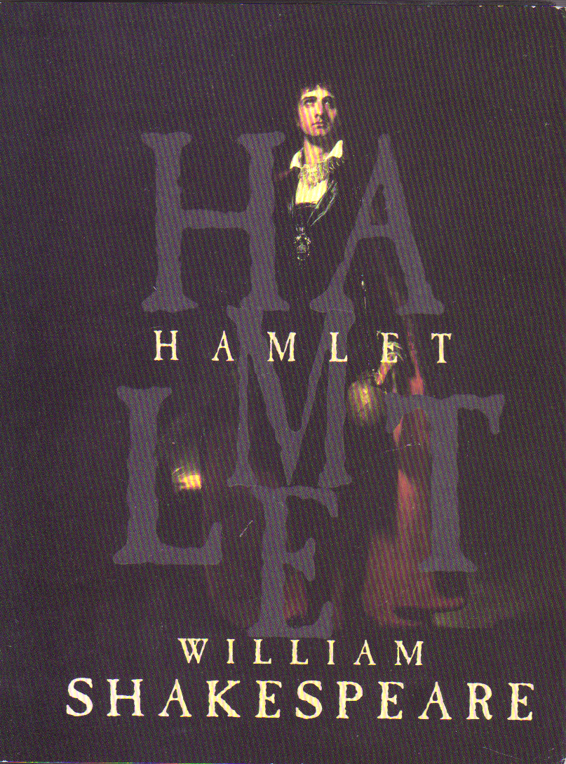 When your English lit professor or your director or your acting coach directs you to a certain passage in a Shakespearean play, does he say, “Please turn to Hamlet, page 783”? No. (Well, first of all, he’s OBVIOUSLY working from an anthology if it has 783 pages to begin with.) He says, “Please turn to Act 2, Scene 2, Line 35.” So what this means is I was smart and brought my little bitty Hamlet and everybody else was stupid and brought their big fat anthologies. And it makes no difference whatsoever.
The two print books, Bible and Shakespearean anthology, have page numbers. But they aren’t referred to or necessary for annotation or bibliography. In fact, the only thing they’re used for is within the book itself to create tables of contents and indices.
So let’s talk about that.
There’s only one thing a table of contents and/or index is good for: To find your place in the book. Thing is, in a print book, that’s the only way you can find anything … maybe kinda sorta quickly.
In an e-book, the tables of contents and indices have completely different purposes. In fact, an index isn’t even necessary in an e-book, although I would argue that a table of contents is. However, their function and mechanism of use are entirely different from that of a print book.
If the argument (with regard to reference material) is that e-reference books can’t be annotated or bibliographed or referenced, there’s a simple way around that. Organize the book in some other fashion, a la the Bible or Shakespeare. It’s been done. The system’s only been around for a few hundred years now. If it ain’t on paper, it ain’t got pages.
And if it’s inevitable, just lay back and enjoy it.
I’ve been thinking about offering a quick’n’dirty series on how to create various ebook formats, wondering if independent publishers (or even micro- and small presses) know how to disseminate their wares effectively in electronic format. I know PDF is the fallback position and while I have a love/hate relationship with PDF (formatting, yay! reading on computer, boo! hiss!), most people who don’t have an ebook reading device pretty much are stuck with the computer.
(This is one reason I have issues with places like Lulu, iUniverse, AuthorHouse, etc. Their electronic delivery is exclusively PDF. I don’t know if the authors have the option to create other formats or even if they’re inclined to do so, but I urge those indies who choose such providers to check it out and diversify.)
Smashwords has a grinder program that allows you to upload your document and then spits out various electronic incarnations of it, but it has formatting issues, which is to say, some it ain’t pretty especially if you have a not-very-well-formatted RTF document to begin with. Oh well and get over it. They do a marvelous job with what they get and it’s a few hundred steps in the right direction—not to mention the fact that once you get it on your ebook reading device, it probably won’t make you any difference.
But in case you do want to know how it’s done (or, more properly, how we did it, properly or not), what tools we used, why—and we invite others to correct us on more efficient ways to do it (that doesn’t involve Book Designer, thanks)—here’s the first and most important thing you have to do:
Learn XHTML and CSS. Really.
O’Reilly at Tools of Change is pushing for all formats to be based on XML, but if you’re reading this post, this is probably a DIY project and XHTML is, IMO, easier to learn. You will need this for every format you might want to offer (except PDB [Palm] and as an ebook application [iApp] to be sold in the iTunes store).
After that, it’s all tweaks and about 6 different pieces of (almost free) software.
Go on now and learn XHTML and CSS. I’m not going to post tutorials on that when others have done it better than I.
Lately I’ve been reading a snowballing number of posts in the ebook community about adopting EPUB as the international (and pleasepleaseplease DRM-free) standard. This is great and I’m SOOO on board with that. What’s got me disturbed is that the subtext (and sometimes it’s not even that subtle) is that in order to adopt EPUB, publishers ought to ditch every other format, I assume, to force the issue of EPUB format adoption for everyone.

Are you serious?
As a consumer and producer of ebooks, let me tell you, this is simple crackpot evangelism. EPUB is the future; I do not disagree and I would love to see it come into its own and beat the competition.
HOWEVER
The competition exists for a reason and that’s because there are competing machines out there. Why in the world wouldn’t a producer find and exploit every digital outlet he could while they exist?
Now, I understand it’s perfectly reasonable for a producer of analog music to give up making vinyl records and 8-track tapes when there are few enough record players and 8-track players that it makes no sense to spend the time to do so. But if there is fairly equal money in each format, it would be foolish for the producer to give up producing even one of those formats.
In short, there is no way we would give up any one of the (now) 10 digital formats we publish in unless and until all devices can and will read one format and that the majority of the users of those devices are choosing one format:
AZW (Kindle)
EPUB (any device using Stanza or Adobe Digital Editions)
HTML (a lot of devices, plus any browser)
IMP (eBookwise)
LIT (Microsoft Reader)
LRF (Sony PRS)
MOBI/PRC (any device using Mobipocket)
PDB (Palm)
PDF (any device that reads PDF), and coming soon,
iApp for the iTunes store (iPhone/iTouch)
The fact of the matter is that once you’ve formatted for one of the above, you’ve formatted for over half the rest with minor tweaks. Yeah, it takes time to make each pretty for its own device, but it’s worth it as long as people feel they’ve gotten their money’s worth.
And every single one of those formats has a serious issue or 3 that consumers don’t like. However, each consumer still has the choice of the format with the least number of annoyances for him. Giving me 1 format (or, in the case of a book I really really really wanted to buy) 4 formats that are pure hell on me isn’t going to get me to adopt those formats; it’s only going to jolt me out of my impulse buy and now that I’m not BUYING paper books anymore, I’ll get it at the library.
So, Hachette Book Group. Thanks for saving me some money, ’cause I wasn’t strong enough to withstand the temptation if it had been in a format I could use.
Thank Mike Cane for this rant.
I’ve read a few self-pubbed books lately. None of them were egregiously horrible in the design department and a couple of them were even fairly decent. And frankly, after I converted them to digital and put them on my ebook reader, it wasn’t an issue at all. But let me take the opportunity today to piss off everybody right up front and then we’ll get to the good stuff.
Design, people. Design is the first reason independent publishing gets no respect. If a reader can’t get past the design, doesn’t matter how good the writing is or isn’t.
I’m not going to worry about discussing cover art today, because, well, I can’t speak. I winged that and after about a year and sixteen different covers, I had enough skills to put this together:

So let’s talk about interiors, shall we? In this I have a wee bit of knowledge, but mostly it comes from J-school.
In my opinion, there are a few basics that should be fairly commonsensical but I’ve seen violated as of late:
In my case, I had a 283,000-word book. I wasn’t going to be able to mess with font sizes much and still fit it all in one spine, which meant I had to do a couple of things I wasn’t happy about, but won’t do on books any shorter. One thing was having to make the font 11 pt. Because in Adobe Jenson, that’s really really really small; on the other hand, the line spacing is 14 pt, which, according to some typography books I’ve read, is a good ratio and I must say my eyeballs agree. The other thing was:
Okay, so here’s an example from The Proviso:
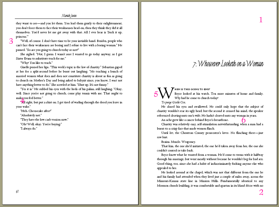
Let’s break it down.
So what’s my point?
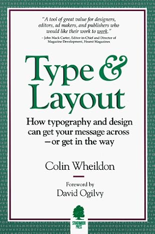 If you are going to try to do these things yourself, learn what makes human eyeballs happy. Read the books. The one I lived and breathed by was this one:
Practice. Experiment. Study the way other books are designed (especially the high-end ones). Notice details. Take notes. Don’t be afraid to throw out your pet specs (the same way you shouldn’t be afraid to throw out your words that don’t work).
Independent publishing is a business just like any other business that sells goods to merchants, which makes it difficult enough for us in an industry that doesn’t do business that way and has a vested interest in keeping the status quo. But you know what? If the last week of handselling has taught me anything, it’s that the readers don’t care who published your book—unless it looks like an unprofessional job.
If they take one look at the book and ask to see it, read the back copy, then flip open the pages to read a little bit, and then whip out their checkbook (especially for a book this expensive), then you’ve done something right. If they aren’t intrigued enough to make it to the back copy, and then the first couple of pages, all the good writing in the world isn’t going to help you. They won’t know why they don’t like looking at it and they’ll care even less, but they will know they just don’t want to look at it.
Bottom line: Once you’re finished with the story inside, forget about it and concentrate on the visuals. The book is the art. It all works together in a symbiotic fashion. Don’t believe me? Ask all those authors whose publishers killed their sales straight out of the gate with a bad cover and bad back copy.
“We don’t know where to put it.”
I do. Right in the readers’ hands.
Over on Teleread, there’s a new blog post today about ebooks being fertile for annotation. I envision this somewhat like a post littered with Wikipedia links to explain things so that the reading audience who doesn’t know what he’s talking about can go get a little primer, and the part of the audience that does know won’t have its reading flow interrupted.
I could have (and still could at any point in the future) litter The Proviso with references and annotations embedded in the ebook editions, but my question is this:
If you had an ebook reader (or if you HAVE an ebook reader), how do you think you’d like such a thing?
On the ebook front, nothing much to report except the iLiad just released a new thingymajig that’s not getting rave reviews. And the Kindle’s not coming out in the UK this year.
On the publishing front, The Mysterious They say that if you’re a midlister or a new author—or an agent specializing in such—y’all are just SOL ’cause the PTBs at major houses are tightening their belts (which means either the smaller houses will be, too or they’ll step in to take up the slack and make a mark).
Yeah. I don’t have that problem.
Oh, one more thing. As a reader, I have a suggestion for you e-publishers: Put the blurb of the book on the first page. That way I haven’t forgotten what the book is about when I open up my ebook reader and see titles and author names. I’m terribly forgetful and have no wish to dive into a book I don’t know what it’s about. Yeah, I downloaded it so it must have intrigued me but now I don’t know why. With my print books, I always go to the blurb to figure out what I want to read next, but obviously, there is no back-of-book on an ebook.
And by the way, we did put The Proviso’s blurb in the front for that very reason.